
Images are a vital part of any website design, but they can also be one of the biggest offenders when it comes to loading times. One way to make sure your images are as optimised as possible is to use responsive images.
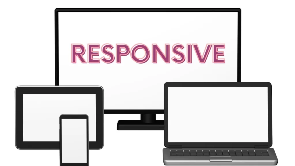
Responsive images automatically resize and adjust themselves to fit the device or screen they’re being viewed on, meaning your website will always look its best no matter what. Here’s why you should consider using responsive images in your web design.
What are responsive images and why are they important in web design?
Responsive images are an important part of web design that allow for optimal image display regardless of whether the website is viewed on a computer, tablet, or smartphone.
By coding the website so that it recognizes the device, the appropriate sized image can be presented to the user. This ensures that both desktop and mobile users get to experience full visuals without unnecessary loading or distorted images caused by serving the wrong size to different devices.
Responsive images also help to create a consistent user experience across multiple platforms and improve page speed, resulting in happier customers and better overall website performance.
How can you make sure your images responsive on all devices?
To ensure your images are responsive on all devices, there are a few essential tips for success. Start by selecting the appropriate file type and sizing it appropriately for the device.
For example, larger images should be compressed to make sure they don’t affect page loading speeds. Additionally, it’s important to use HTML attributes like width, height, and alt tags. This allows online browsers to adjust image sizes accordingly based on the device while also increasing accessibility across platforms.
Lastly, consider using a display density switch or dedicated media queries to facilitate better user experience — especially on mobile platforms. Implementing these techniques will help you guarantee that your images are shown correctly no matter which device your end-users utilize.
What are some common mistakes people make with responsive images?
Responsive images are a key element of modern web development due to the need to support a wide range of devices, and making mistakes with them can lead to pages taking longer to load and displaying unexpected behavior.
For example, some people mistakenly think that the size attribute sets the display size of an image, which it does not; instead it sets the size of an image delivered by the server. Similarly, some people don’t compress large images enough, leading them to take much longer than necessary to download on mobile platforms.
It is also important not to rely too heavily on CSS or JavaScript when resizing images – both can be unreliable on certain browsers or devices and should only be used sparingly.
By avoiding these common mistakes and ensuring that their responsive images are optimised for any given situation, developers can ensure that users have a seamless experience across all platforms.
After all these responsiveness of image there is also need to use the best format of image which is familiar with search Engines as well. For this you can convert your image from png to webp to use on a website.
How can you troubleshoot problems with responsive images on your website?
Troubleshooting problems with responsive images on your website is a task that does not have to be intimidating. The most important part of this process is knowing where to look for issues.
Start by testing all webpages within the browser, checking if the images adjust properly as the window size changes. It’s also important to double-check any media queries and make sure that they are correctly setup to target the sizes you want them to.
After these basics have been checked, you can move onto more detailed debugging by using tools such as Device Mode in Chrome DevTools or Firefox Developer Tools to make sure every image looks good no matter what device it is viewed on. With some patience and an eye for detail, it’s easy to ensure that your webpage displays its images optimally!
Also Read: Salon App DevelopmentAre there any other tips or tricks for dealing with responsive images in web design projects?
When dealing with responsive images in web design projects, it is important to consider the different types of devices on which the design will appear. It’s a good idea to think about image optimization and what types of formats are best suited for each device saving time and data by optimizing where necessary.
Utilizing HTML elements such as helps by allowing developers to create multiple sources for specific sizes, while srcset lets developers create multiple size options in one element.
Additionally, since small screen resolutions require smaller file sizes and larger screen resolutions require larger ones, leveraging network intelligence such as browser data points can help dynamically serve the right responsive images for each device.
Making sure your images are responsive is an important part of modern web design. By using the tips and tricks in this article, you can make sure that your images look great on all devices, no matter what size or resolution they may be.
And if you ever run into any problems with responsive images on your website, don’t hesitate to reach out to a professional web designer for help.